Five principles
- The stammer is welcome. Openness is the brand, not a problem to hide.
- Every moment is the same size. No feeling is bigger, brighter or more rewarded than another.
- Colour is never the only signal. Every feeling family has a shape and a name as well as a colour.
- Calm surfaces, expressive marks. Content sits on quiet linen and moss. Personality lives in the shapes and the lettering.
- Nothing to finish. No scores, streaks, progress bars or completion states.
Name and mark
In text, write Beyond Fluency: two words, both capitalised. The wordmark is set in lower case, beyond fluency, in Young Serif. Please don’t shorten it to “BF”, join the words, or translate the name. The name is the idea: life is bigger than fluency.
The mark is three feeling shapes resting together: a pebble, two seeds grown together, and a bloom. Each stays whole, kept apart by a thin gap. Feelings can sit side by side without blending.
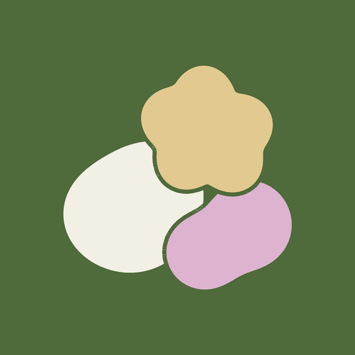 App icon
- Leave clear space around the icon and wordmark of at least half the mark’s height.
- Use the icon at 32 px or larger, and the wordmark at 120 px wide or larger.
- Don’t recolour, stretch, rotate, outline or add shadows, and don’t place the marks on busy photographs.
- Don’t recreate the marks. Use the files in Downloads.
The lettering
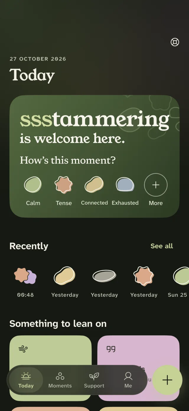
“ssstammering” repeats its first letter on purpose. The three letters sit together in one steady moss colour: present, not fading away. It is a brand moment, made by people who stammer, and it’s set with care:
- Use it only as display lettering for the brand, such as the welcome screen, a headline or a poster, followed by “is welcome here.”
- Never apply it to people’s names, to what someone has written, to buttons, or to notifications.
- Never use repeated letters to imitate someone’s speech, or for a joke. Never animate the letters to shake, jitter or loop.
- Screen readers hear one ordinary word. In code, label the lettering “stammering”.
Colour
Moss and linen: the colours of a walk, a garden or a well-used notebook. They sit apart from the blues, sea greens and corals that stammering organisations and awareness campaigns use, so Beyond Fluency is never mistaken for one of them.
Text meets WCAG AA contrast (at least 4.5:1) in light, dark and high-contrast modes. Accents are fills, not text colours, on linen. Red and green are never used to mean “bad” and “good”.
Type
The lettering, the wordmark and large titles, 28 px and up. One weight; never bold or slanted.
ssstammering is welcome here.
Interface and body text. Designed by the Braille Institute so letters are hard to confuse.
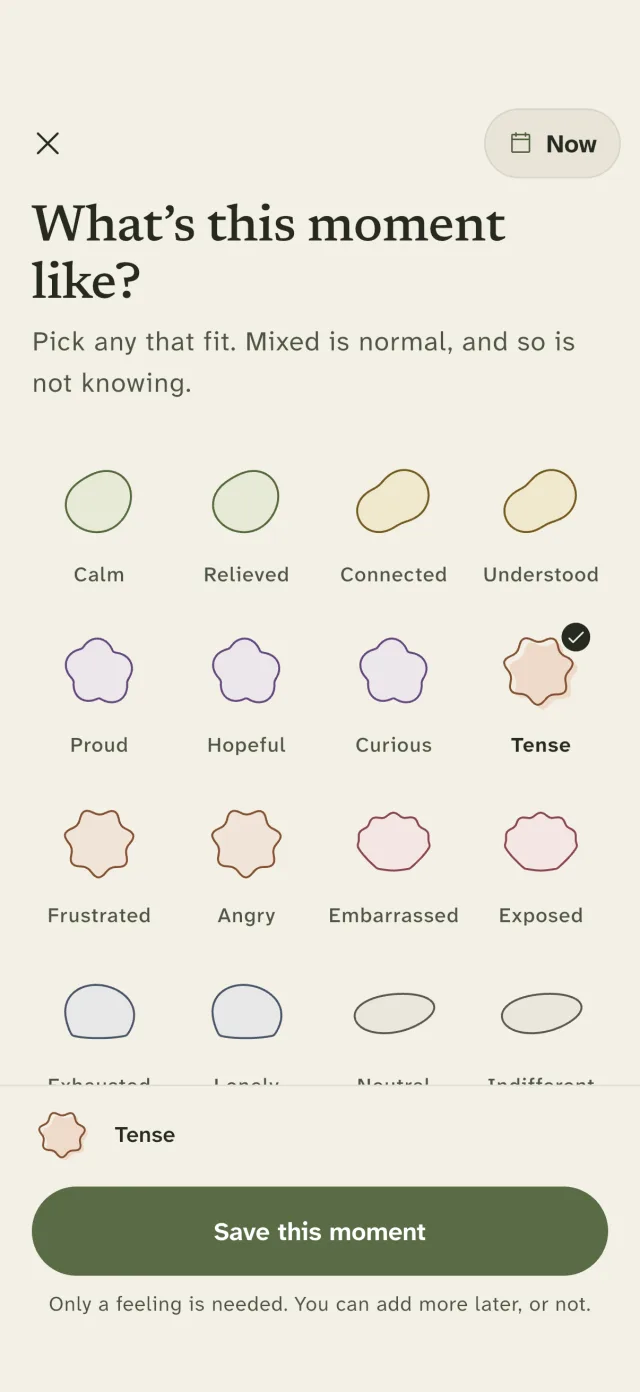
Pick any that fit. Mixed is normal.
Reflections and the person’s own words.
What’s this moment like?
All three are open-source fonts under the SIL Open Font Licence, and they’re served from this site.
Feeling shapes
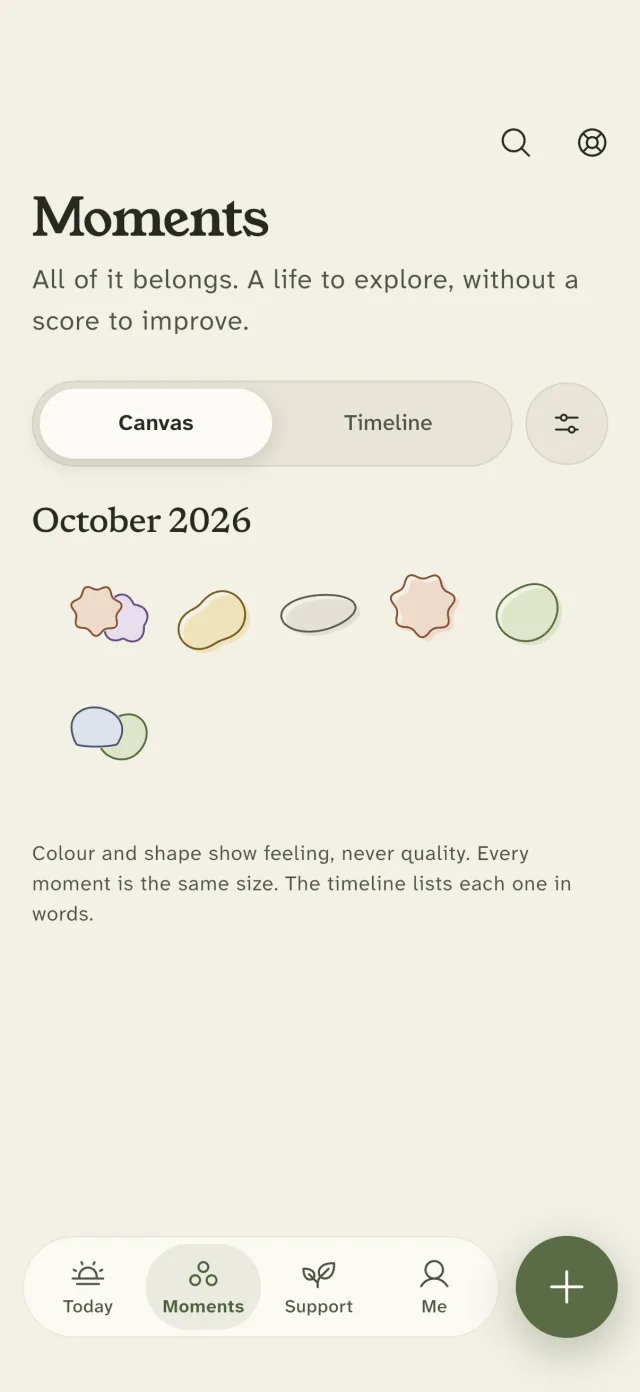
Feelings are grouped into seven families, each with its own hand-drawn shape and colour, all the same size. A chosen feeling is printed like a hand-pressed stamp, its outline landing slightly off its colour. Mixed feelings overlap and are never blended. Difficult feelings never get warning colours or sharper shapes, and pleasant ones never get celebration.
The shapes are generated from one source for the app and this site, so they always match.
Icons and motion
- Icons are Phosphor Regular: soft, rounded and quiet. Feature icons sit on a soft paper-note shape. Feeling shapes are kept for feelings only, so no shape ever implies a meaning it shouldn’t.
- Things settle; they don’t perform. Shapes are set down once, like pebbles on a table, and stop. Nothing loops, flashes, shakes or counts up.
- Every animation respects the reduced-motion setting, and nothing is hidden waiting for an animation to show it.
Voice
Warm, plain and unhurried. Short sentences, Irish and UK spelling, and no pressure. We describe; we don’t judge. We follow the language people who stammer use about themselves.
We say
- people who stammer; stammer or stutter
- a moment; how it felt; how others listened
- optional; if you’d like; or never
- your own words; take what helps
- a wellbeing journal
We don’t say
- suffers from, overcome, cure, fix, defect
- fluent, relapse, progress or success about speech
- scores, streaks, goals, “keep it up!”
- “look on the bright side”, or any forced positivity
- therapy, treatment, or claims that the app improves speech or health
Imagery
- Use the app’s own shapes, mark and screenshots. Screenshots only ever show made-up sample moments, never a real journal.
- If you show people, show real people who stammer, with their permission, in ordinary moments.
- Avoid hands over mouths, tangled speech bubbles, microphones, sound waves, “before and after” framing, and anything that makes stammering look like a problem to hide or a punchline.
Staying distinct
Beyond Fluency is supported by EaseTalk and is otherwise independent. The app and this site name stammering associations and helplines only to point people to their services, in plain text. We never use their names, logos, colours, flags or slogans as part of our own identity, and none of them endorses Beyond Fluency.
- Please don’t pair Beyond Fluency with the logos, flags, ribbons or campaign colours of other organisations.
- Please don’t describe the app as connected with, approved by or made with any organisation unless we’ve announced that together.
About Beyond Fluency, for press
Short (about 30 words)
Beyond Fluency is a free, private wellbeing journal for adults who stammer, made by two people who stammer. No speech scores, no microphone, no streaks, and nothing leaves your phone.
Longer (about 110 words)
Beyond Fluency is a free wellbeing journal for adults who stammer, made by Marco Faggiani and Tea Falade, two people who stammer, to raise awareness and to embrace the stammer, not to chase fluency. Its name comes from Tea’s research with adults who stammer at RCSI University of Medicine and Health Sciences. People name how a moment felt in seconds (mixed feelings and “I don’t know” are welcome), and can add context, reflections, small goals of their own or words for self-advocacy if they choose. It never listens to or rates speech and has no streaks or scores. The journal is encrypted and stays on the phone, with no account, ads or analytics. Beyond Fluency is not a medical device or therapy.
Press and partnership contact: marcofaggiani04@gmail.com
Downloads
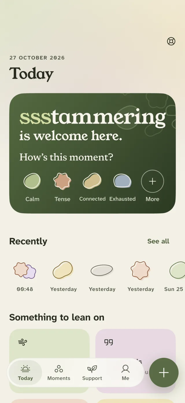
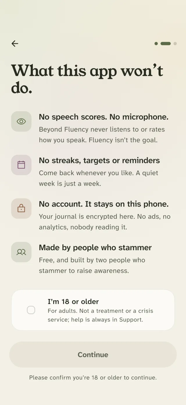
Screenshots: Today, capturing a moment, Moments, Today in dark mode, what the app won’t do.
Credits and licences
- The mark, icon, feeling shapes and lettering are original Beyond Fluency artwork.
- Fonts: Young Serif, Atkinson Hyperlegible Next and Newsreader, under the SIL Open Font Licence 1.1 (Young Serif, Atkinson Hyperlegible Next, Newsreader).
- Icons: Phosphor, under the MIT licence.